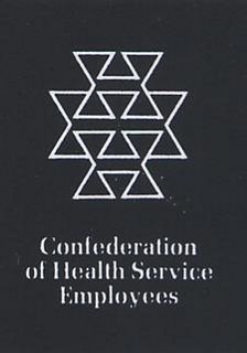
That New COHSE Logo (interlocking H's)
by Ted Blackshaw
February 1972
This month sees the first issue of the re-styled COHSE “Health Services journal”. It has been re-designed to provide the Confederation with a readily identifiable and unifying image. This new look will also affect all printed material from letterheads to posters, subscription cards to bulletins.
A complete, visually satisfying theme has been needed for some time, especially for stationary, as the superseded material has become out-moded and no longer reflects COHSE has become or the technically sophisticated environment in which COHSE It is employed.
It is important to the Confederation, as in any business, that outsiders should think well of it. Since it is frequently by way of published material that others come in contact with an organisation and form first opinions of it, those concerned should be -confident that it will be an effective; if silent representative.
You will see in the illustrations on this page that, for identification purposes the design carries two principal units, 1. The Title, and 2. The Symbol.
In this case one was needed that would, primarily, be extremely legible and give an individual character to the title. The typeface chosen satisfies both these requirements with the added bonus of being modern in appearance without losing dignity.
Second, the symbol: It is usual in the design of symbols to utilise some object which is so significant that it can represent the industry involved. For example, a gear wheel could represent engineering, a lorry might signify transport.
The working environment of COHSE members offers no single object which satisfies this requirement. However, of existing symbols there arc the cross and the letter H, both used for road signs and readily acceptable to anyone as meaning Hospital. The letter H is also the initial letler of the word Health and appears in the title of the Confederation. This, therefore, provided an apt starting point for the de-sign of the new symbol.
One more requirement of the design was. necessary, that of representing COHSE as a trade union.
This has been achieved by locking together four H's suggesting that the strength of the organisation lies in the unity of its members. The diagrams on this page show clearly the H members and how they fit together.
The third component of the new identity appears on the cover of this journal – the colour. Generally, choosing colour and pulling it to work is essentially personal and cannot be expected to please everyone.
Yet, some basic principles and logic have been employed in the choice. To avoid the more obvious colours, pillar box red, sky blue or leaf green, a colour with a degree of subtlety was found which sets it aside from those normally used in printed matter of this nature.
To some, the idea of change is disturbing and others might feel that the old familiar things are adequate, but, the boost to morale and sense of progress that a change of this kind generates proves it worthwhile.
NOTE
Interlocking H's
Used on the journal and head office stationary but never a popular choice and COHSE soon returned to the rose logo and later adding COHSE into the logo

